Web Design Trends
Web Design Trends since 2000
Web Design Trends From 2000
There have been many changes in websites and web design over the decades. Over the years, there have been some significant technological advances. Some of these include smartphones, laptops, and virtual reality. When we look at the technologies we started with, we can learn from what we find. Looking back through the years, beginning with the early 2000s, we can see how they didn’t focus on the actual design aspect of the website.
Web designers today care a lot more about how a site looks and how easy it is to use than they did in the past years. Websites were initially used for personal use, but now they are more often used by the public. Businesses use them to sell their products or spread awareness. Web designers are much more focused on designing a website for their users. They aim to make it as appealing and easy to use as possible. As we move through the years of web design and development, you will see some of our advances and learn where some of our techniques started.
What is Web Design?
Before we look at the web design trends over the years, we need to understand what web design is. Web design is simply the process of creating a website. This may sound simple enough, but designing and building requires several steps, systems, and time. Some of the formats we use to build the websites you see today are HTML, CSS, and JavaScript. HTML is usually where you start creating your webpage. This usually involves adding the page title, pictures, the “perfect” page content, and links.
Once we have used HTML to structure the website, we use CSS to style it. This includes the font, text, image sizing, and the colors you plan to use on your page. Finally, we use JavaScript to enhance the webpage’s interactivity. As you can probably see, this is a long process with many steps. There is a lot of coding involved. Most of it is very simple, but there are more complex parts.
Web Design Trends Timeline
In the early 2000s, most websites consisted of text only. If you were to check them now, you’d probably say they were the worst websites to view. Hey, but they were functional! They had no design aspects because there was no way to implement them. However, there were visual breakthroughs, and directories and navigation elements were developed a few years later. Some of the introduced features we use today include minimum images, links, and the appearance of search boxes. We still use most of these, but they have been significantly modified to improve user experience as we move further into the years. You will see many design elements that are still used today. However, they had changed from when they first started.
2003 – 2005
More advances occurred quickly. Between 2003 and 2005, Flash, Splash, and millions of colors were added to web design. Flash was a specialized Multimedia software platform for creating desktop applications, mobile applications, games, and more. In the early stages of web design, Flash was used to build websites instead of HTML. It was so popular because it could do things that HTML, CSS, and JavaScript couldn’t.
2006 – 2008
New web design trends came with the introduction of mobile devices to the public. This created a massive change in how websites were needed and what they had to work on. Instead of only working on laptops and computers, websites also needed to work on mobile devices. They had to be adaptable to smaller, thinner screen sizes. Due to the small screen size, websites need long-scrolling pages. This allowed all the original information to be carried over onto mobile device applications. If this extended scrolling were not included, websites on mobile devices would have to be extremely small. The website might also cut off, preventing mobile users from viewing the whole site.
Flash software, used for web design, fell out of favor in 2007. The first iPhone was released then, and unfortunately, it didn’t support Flash.
2009 – 2011
In 2010, oversized headers and huge image backgrounds became the new trend. It was popular to use a large background image on the home screen and place the text on top. Typography, style, and letter fonts also became very popular. People started using sIFR and Cufon. Both JavaScript and Flash were used to enable typography. Another trend that has come back several times over the years is minimalism. Minimalism uses lots of white space to make the website look cleaner and simpler. Oversized footers were also very popular at this time.
2012 – 2014
Mobile devices with tiny screens were increasingly popular. Web designers moved their focus to responsiveness to these devices. HTML5, CSS3, and jQuery also became widely used. CSS3 Incorporated rounded corners and implemented new text features in web design. These new text features were a vast improvement due to the popularity of custom web fonts.
JQuery was an open-source JavaScript library. HTML5 added a new structure format for sections, headers, footers, navigation, and more. It also added support for Canvas audio and video. Many web designers preferred this because it was compact, robust, reusable, lightweight, and supported animations. Infographics also became very popular at this time. Most companies use them to spread their ideas and data to the public.
2015 – 2017
Web design trends aimed at storytelling were key during 2015-2017. Businesses began using their sites to tell their stories and interact with the public. This also explains why businesses started using custom photography instead of stock photo backgrounds. Professional photography became a better way to show the public what the company is about. The abundance of large header background images has grown exponentially in recent years. This led to a decline in this design trend. Most companies wanted to stand out, and since so many people were using this design element, the company chose to steer clear of it.
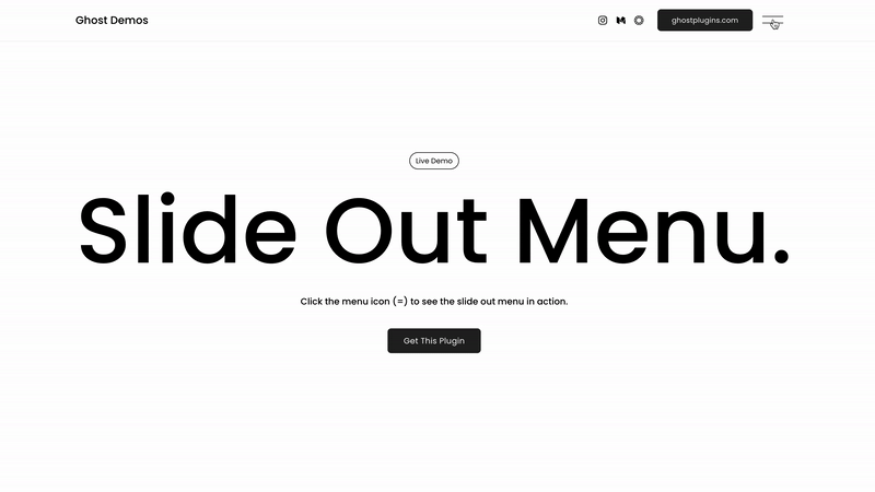
There was a greater need for simplicity in this era, leading to slide-outs and hidden menus on websites.
As the years passed, Flash became less popular. In 2015, Google moved all its YouTube videos to HTML5, a big blow to Adobe Flash. In 2017, Adobe officially announced that it would stop working on Flash by 2020. Without new features and advancements, Flash will become less popular and obsolete.
2018
Recent web design trends include a rise in websites’ interactive capabilities. In 2018, chatbots, animation, and micro-interaction were introduced. Businesses started using chatbots on their websites to allow users to chat with representatives and get their questions answered immediately. The animation was also used as background and in images—a more advanced type of animation micro-interaction that changes based on user interactions.
This year, there are many more changes with color palettes and layouts. Designers are using more vibrant colors to catch the user’s attention. For the layout, a simpler design is emerging. The minimalistic asymmetrical layout is growing in popularity. This layout is more complicated to execute, though. It takes time to incorporate many of these new design features.
Prepare Your Website for 2025 and Beyond
To stay competitive in an era of evolving web technologies, businesses must adapt now. Whether you’re a web designer keen to refine your craft, a small business owner looking to make an impactful online presence, or a digital marketer aiming to maximize conversions, keeping up with these design trends is non-negotiable.
Pay attention to user needs, invest in cutting-edge technologies, and prioritize accessibility and sustainability. The future of web design is about creating experiences that engage, inspire, and drive results.
Personalized Experiences & The Future
Websites beyond 2026 are set to evolve into intelligent and immersive platforms that feel more like personalized experiences than traditional digital spaces. Thanks to advancements in AI and machine learning, websites will anticipate user needs, offering tailored content and seamless real-time interactions. At the same time, technologies such as augmented and virtual reality will create engaging, lifelike experiences, allowing users to explore products and services in entirely new ways.
Moreover, with the rise of Web3 and blockchain, users will gain greater control over their data, fostering trust and transparency. Sustainability will also play a key role as businesses increasingly adopt energy-efficient designs and eco-friendly hosting solutions. In essence, websites will no longer be tools; they will become dynamic and adaptive spaces that connect, engage, and inspire in ways we have never seen before.
Ready to bring these cutting-edge trends to your website? Connect with an expert designer or development team today and ensure your online presence stays ahead of the curve!
Request a Quote :


A Deeper Dive into Web Design Trends
Generally, websites should be legible, informative, and maybe even sleek, but if you visit mikiyakobayashi.com, you will realize there is much more to the web than just coding a couple of lines one day. This site pushes the boundaries of what is possible on the web. When you launch it, you will immediately realize its unique blend of photos, information, and interface.
It started in 1991
Web pages were lackluster because these web developers didn’t have the tools we have today; because of this, the past web trends were very different from today’s web trends. The first web page was published in 1991 and was merely a couple of lines of text with links leading to a similar web page. The white background and single font are impressive by today’s standards, yet it was “the” standard back then. An evolutionary trend of the past, like adding color to a page, would now be more of a necessity.
An old snapshot of Bloomberg.com can be found on the Wayback Machine and shows just how primitive things looked in 1996, despite being five years late.
Not all sites had to be like this. However, some sites had authentic colors and even logos! For example, McDonald’s had a website with its trademark look. The red on the page would have left you thinking that this was a massive technological jump and that having color was “impressive” at the time. But this website was somewhat of a disaster. It’s good that it was pretty empty, because reading more than a couple of lines on the tomato-red background with yellow cheese writing would have given even Ronald McDonald a migraine.
If you look at the McDonald’s website, you’ll see that it has come a long way. The use of red is very sparse, and instead, there are lots of blacks, whites, and dark grays. This is a huge step because it makes everything legible and toned down.
Apple & Microsoft
Things weren’t always hideous on ’90s web pages. In 1998, Apple made great use of pictures and minimalism to make a website that still stands well today. Microsoft.com from 1999 stood out. This website wasn’t as flashy or aesthetically pleasing as the Apple website, but it did a great job separating the paragraphs on the page, making them all readable. Also, the blue color shows what was clickable and what wasn’t. The key goal of this Microsoft website was to make it usable for “anyone.”
Hamburger Menu
You might have seen the “hamburger menu” in the top corner of many websites and mobile apps today. First of all, the “Hamburger menu” is one of them. It is three lines stacked together to roughly form the shape of a hamburger. The primary purpose of the hamburger menu is to incorporate a site menu without taking up too much room. The hidden menus of the hamburger menu usually have less importance.
Moreover, the hamburger menu provides direct access, allowing users to open more specific items instead of scrolling through every item in order. It enhances usability and speed, especially for mobile users who expect faster access, even more than on the web. The most common example of a hamburger menu is Facebook. Users can tap the hamburger menu to access all other features.
Micro Interactions
Micro-interactions are still popular. We can experience micro-interactions on many websites today. They contain product moments focused on a single use case and have a single primary task. For example, simple moments of engagement happen when we press an elevator button to like a photo on Instagram. We are performing micro-interactions. You engage in a micro-interaction whenever you set the alarm, log in, or “like” something. This means that micro-interactions are everywhere in the environment where we work and live, regardless of whether we use phones or desktops.
Micro-interactions are an essential part of almost every digital design project. Even though we live with micro-interactions daily, they are not easy to recognize because of their small size and invisibility. However, they can make our lives easier and more fun. Micro-interactions are loved because they are well-suited for accomplishing a single task, connecting devices, adjusting settings, etc. Well-organized and well-designed micro-interactions will make websites more user-friendly and creative, and make them more trendy.
Typography
There is no doubt about how visual elements on websites impact users. This is why typography is becoming popular and a key web trend. Well-designed typography significantly affects many aspects of our website, including readability, mood, vision, and much more. What is typography exactly? In his book, Rober Bringhurst, a Canadian typographer, describes it as “the craft of human language with a durable visual form. The primary purpose is not to make the site beautiful—more than that, it ensures the type is readable.
Most websites contain content that occupies more than 80% of the website. Typography guides the readers through your content. Good typography will emphasize the essential parts of your content and attract customers and readers. Moreover, typography can help maintain consistency across websites. Inconsistency and chaos make users’ experiences frustrating, and they will not return to your site. Good typography enables you to solve those problems and tidy things up. It makes it easy to read and find information.
Typography affects the design of your website and how you convey your content to readers. Well-designed typography will make your website more beautiful and helpful to visitors.
Color Schemes & Website Colors
Color schemes are another vital part of the design that changes. Colors are becoming brighter and bolder, with an almost retro feel. These palettes are clean and simple, with as few as two vivid colors on a page. Color overlays and full-page, duotone gradients also seem popular on contemporary websites. It seemed for a while like the whole tech world was hurdling into the blue—with Facebook, Twitter, Tumblr, Skype, PayPal, and countless other significant sites all featuring similar shades of blue in their logos and designs—but now pastels, neon, and earth tones are all popping up, with some color schemes looking like they’re straight out of the 60s or 80s.
Many websites are dedicated solely to color palettes for web designers. Previously, designers were limited to selecting only 216 “web-safe” colors. However, with advances in technology, millions of colors are now available to web developers.
Now, we can fast-forward to today and see what today’s web trends look like and how they enhance the user experience. According to Wpmudev, some of the hottest trends include website color schemes and Google’s “Material Design” concept.
The Importance of Color
Color is essential for aesthetics and usability, but the focus should be on the psychology behind it. How do specific colors make us feel? Designers of the past didn’t think about what their color “meant” or how the audience would perceive it; they didn’t even think about whether it looked good. They boldly declare that green will be the trending color. Green is “a symbol of new beginnings, a refreshing and revitalizing shade.” This idea of the psychology behind color shows how much harder web designers work today than before.
Material Design
Google came up with this idea. They aim to “create a visual language for our users that synthesizes the classic principles of good design with the innovation and possibility of technology and science.” They encourage other sites to follow suit and are trying to set the standard for what design means in creating an extremely intuitive website. This is a bible for creating a beautiful website, and more and more web designers will follow the guidelines.
Material design encompasses everything from usability, patterns, and style to movement, scrolling techniques, and platform adaptation. These elements might become trends, but one thing is sure: Google’s Material Design will inspire websites.
Rich Animations
More websites incorporate lively, rich animations. From tiny, detailed touches to large animations that fill the whole page, animation is used more than ever in web design. Animated transitions between pages, animated notifications, micro-interactions, or just animations for fun help guide users and liven up a web page. As more tools become available, the age of Flash animations is ending, and animations no longer slow down servers or interfere with loading time the way they used to.
Overall, the world of design is becoming increasingly minimalistic. We’ve seen this gradually happening in logos and other designs for the last decade, and the web is no exception. With minimalism, information is presented straightforwardly—in other words, “less is more.” Simpler designs focus more on content, with a single focal point per screen. With solid typography and color schemes, minimalism gives pages a bold, sophisticated feel.
Skeuomorphism Style
Skeuomorphism, a style that involves realistic shading to make 2D elements appear 3D, has fallen out of favor. Drop shadows, textures, and natural gradients have nearly disappeared from the web and technology, favoring flat design instead. When Apple dropped skeuomorphism in favor of a flat design with iOS 7 in 2013, many reported that the new look resembled a Fisher-Price toy. However, others have followed suit, and flat design has become the standard for on-screen aesthetics.
These changes in the user interface can be observed not only in brand-new websites but also in sites that have existed for years. Google, for instance, arguably set many of the trends in web design we see today. A pioneer of web minimalism, Google has evolved and modernized its look without endangering its brand over the years. By honing in on those four colors on a white background, they have created a minimal, recognizable brand across the web. In their most recent change of flattening their typography into the vast, sans-serif logo we know today, Google has set the standard for the new age of minimalism.
Infinite Scrolling
Infinite scrolling has become a popular navigation method. It works well with mobile devices and touch controls. It’s simple and more engaging for the user. When implementing long scrolling on a site, it’s a good idea to use visual cues. Whether subtle or noticeable, you want to let people know that the content will be displayed linearly. Each screen should be treated as its own page, with a new way to transition between them.
You want the screens to have an overall theme or connect them so everything looks organized. One thing to remember is that users may get lost as they go along. A sticky navigation system can solve that problem. Other solutions include a Jump-to or Go-to-top link. Scroll-triggered animations work well with this method. They keep users interested and can even be entertaining and game-like.
Stock Photos
Illustrations are replacing stock photos and other imagery used on websites. They offer more imagination and personalization than a professional photo shoot at a lower price. Designers have more control over the images themselves and the technical aspects. There are many things an illustration can convey more simply and effectively than a photograph. Animations and layers are often used with illustrations to add depth and creativity. As always, you want all elements of the site to look united. Even if the site’s theme doesn’t include illustrations, they are helpful for tutorials or quick How-to guides. If users have fun while learning, it will feel less like a chore.
Flat design
Flat design is still widely used. Its aesthetics are simple, and the site’s functionality is improved. It’s also much easier to navigate, leading to a better user experience. Flat design helps sites load faster and is suitable for phones and tablets. It’s also easier to use with a touchscreen. Designing these sites is more straightforward and functions well, even with more layering and animations.
Virtual Reality (VR)
Websites are still not mainstream. However, technology is pushing toward mainstream adoption, and for this to happen, the web must change to accommodate it. Major sites like YouTube have already used this technology by adding 360-degree video accessible with a virtual reality headset, and many other websites will follow.
VR is still a relatively new technology, yet many websites are ready to support it. This will only continue as recent web trends emerge. Netflix now supports VR, and Google Maps Street View does too. With YouTube, Google, and Netflix already on the VR train, it’s hard to imagine other websites won’t jump on, too.
Benefits of Understanding the History of Web Design
Have you heard the saying, “You can learn from the past?” Well, this is quite true in this case. Web design trends seem to have resurfaced several times over the years. Minimalism is an excellent example. You might also not be aware of several techniques that have been used in the past. Learning where something came from or why we use it a certain way can improve our understanding.
You can implement past trends into web designs today, analyze past websites, and learn from them. Many web design trends have died for good reasons. Most of them cluttered the website, and users seemed to prefer simplicity.
Takeaway On Web Design Trends
Over the years, web design has changed dramatically, from static business websites and popular social media platforms to data-driven SEO web services. This makes it an exciting topic for web designers and people interested in building sites. Understanding the history of web design and some of the trends used today can be very beneficial. Also, knowing which top websites use standard practices can help ensure your site meets your visitors’ needs.
What is possible in web design
The great thing about web design is that there are no “right” ways to make a website. Hundreds of websites make daily decisions based on many factors, so the innovation is endless. We know what is essential for websites: usability and appearance, and what this year’s landscape might look like. For example, it could emphasize green and the emotions that colors give, the precedent set by Google’s “material design” and support for virtual reality, but this is merely part of the web design industry.
The once “boring” black-and-white web is now a land of endless possibilities. In the coming years, there is no telling what trends will emerge and how they will change how we use the internet.
Digital Marketing Services with Top Web Designers & A Top Global SEO Company
Stick around with us, and we’d be sure to make sure your ahead of the competition when it comes to web design trends!
Web Design & SEO Services for Small Businesses
At Visualwebz, we provide a range of WordPress web design, website development, and web marketing services to a diverse group of small businesses. We deliver WordPress website design for large companies, SEO for startups, and e-commerce websites for brick-and-mortar small businesses. Our web developers have a strong understanding of the needs of small businesses. Furthermore, we encourage you to read Visualwebz reviews and see why our customers are happy with our work and outcomes.
Learn more about our Web Agency
Not the Average Web Design Trends & Web Design Services
Your small business will succeed with our web design and Online Marketing services. Be it a startup, elderly care, dentist, medical practice, an attorney with a law firm, day-care, investment firm, or hair salon. We can do it. Hire a local small business that will help your business grow. Our web design and SEO services are the best for companies. We back our word with over a decade of web design and online marketing experience.
Web Design & SEO for local Small Businesses
- If you are looking for website developers near you, you’ve come to the right place! We provide web services in the following areas: Seattle, Bellingham, Des Moines, Bellevue, Issaquah, Burien, Federal Way, Olympia, Fife, Maple Valley, Mill Creek, Covington, Des Moines, and Seatac.
Web Design & Professional Website Development
-
- Seattle Web development includes numerous online services, including SEO and online marketing. As a result, some local areas we serve include Washington State | Auburn | Bellevue | Eastside – Bellevue | Bellevue Website Design – Local Website Firm | Bothell | Des Moines | Federal Way | Fife | Issaquah | Kent | Kirkland, WA | Lacey | Lakewood | Lynwood | Maple Valley | Mercer Island | Marysville | Mill Creek | Seatac. WA | Tacoma | Tukwila | Vancouver | Everett | Spokane | Seatac | Renton | Seatac.
- Website Design Services available in and around Belltown | Fremont | Madison Park | Capitol Hill | West Seattle | Queen Anne | Magnolia | Downtown Seattle | Northgate.
Whether you are an attorney with a law firm, school, dentist, or any other small business, hire a local web developer for your web page design and online marketing services.
Web Design for Small Businesses
Be it an attorney, dentist, or any other type of startup or small business you may have? Contact Visualwebz for the perfect online solution. We have the right web development skills to get your business competing.